Collection
Welcome to the Brooklyn Museum’s online collection, where you’ll find a wealth of information about many works in our rich holdings. We hope these records inspire you to explore further—both online and in our galleries.
Collection Areas


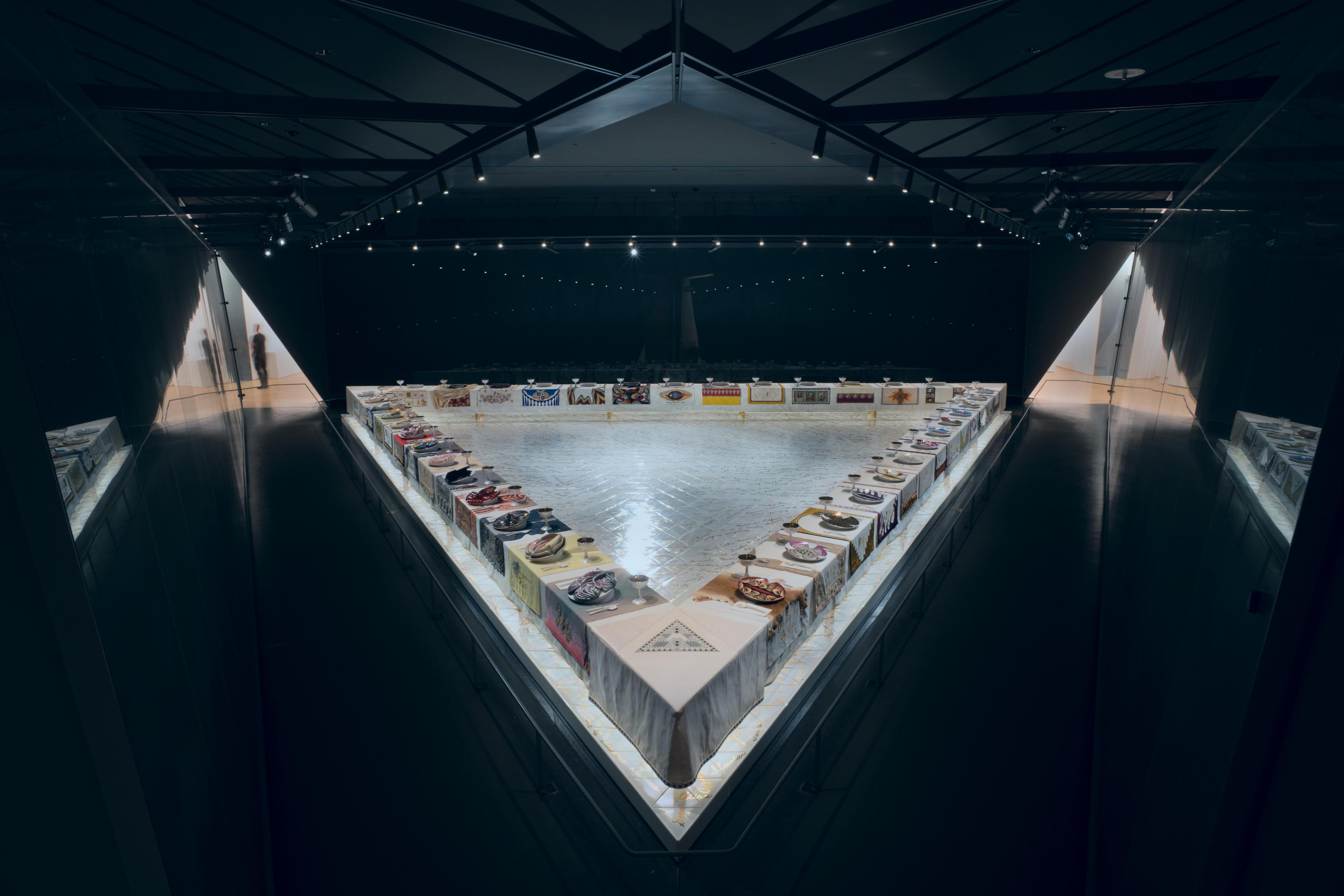


Brooklyn Icons
Chosen in honor of our 200th anniversary, these 200 works teach us about creative innovation, social movements, and our shared humanity.
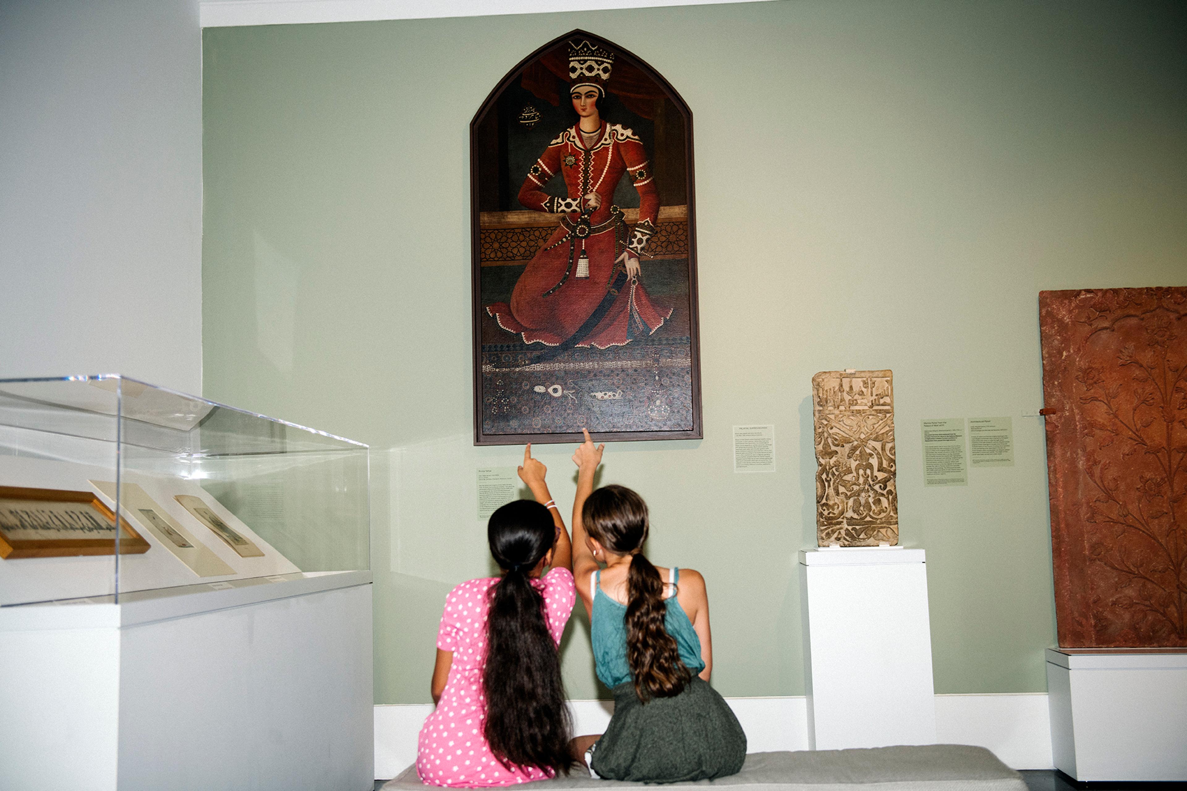
I really vibed with the Feminist art section at the Brooklyn Museum.
Dominic P.
Research
Delve deeper into the Brooklyn Museum and its sweeping collection by perusing our resources for researchers.
Image services
Need an image of a work in our collection? We’re here to help.
This database is being continually expanded and updated. Not all works are on view. You can find objects’ locations in their records.
Have information on an artwork? Contact bkmcollections@brooklynmuseum.org .