

As I mentioned in my previous post about mapping our digital landscape, we’re not letting the lack of CRM completely get us down. We have…
Read More
As a follow-up to our ASK-guided gallery tours for Frida Kahlo: Appearances Can Be Deceiving and Pride Month, the ASK team has created a new…
Read More
In 2017 we partnered with educational start-up Duolingo and their new digital platform, Tinycards, to produce fun and educational art history flashcard decks. 2 years,…
Read More
“Celebrate Pride Month! Our team of friendly experts guide you on a tour of LGBTQ+ artists and themes throughout the Museum via text message, chatting…
Read More
The second evaluation completed by Pratt grad students last semester examined the ways visitors were using ASK. Partially inspired by wanting to know if people were participating…
Read More
In my last post, I posited that although we don’t have a CRM, we are gathering data in the ways we can to help inform…
Read More
One of my personal and professional goals for the Visitor Experience and Engagement department is to make more data-driven decisions. We’ve written A LOT about…
Read More
Our exhibition Frida Kahlo: Appearances Can Be Deceiving closed on May 12 and we’re taking a moment to review our ASK engagement for this show….
Read More
In my last post I detailed how I knitted together thematic connections across different collections and what effect in-gallery labels have on object engagement, but…
Read More
While I wanted to learn more about visitors complete interactions through the app, without the ability to systematically dive into chats, I chose to focus…
Read More
I ended my last post with a brief exploration of what people are asking about via ASK. I was particularly interested in going beyond the…
Read More
Our major exhibition for this spring, Frida Kahlo: Appearances Can Be Deceiving, has been very well-attended and well-received so far. It has also posed unique…
Read More
During my first semester as the Pratt Visitor Experience & Engagement fellow I was able to learn a significant amount about ASK user behavior—despite limitations…
Read More
In my last post, I laid out some of the challenges working with the current metrics dashboard and the data exporting process for ASK. Despite…
Read More
As the Pratt Visitor Experience & Engagement Fellow, I was tasked with conducting a deep dive into ASK-related data. There are several research questions that…
Read More
From March through July 2018, the Brooklyn Museum was the home of the multimedia exhibition David Bowie is. It was the twelfth and final stop…
Read More
I will admit, I’m a little embarrassed that it’s been more than a year since our last post. Rest assured, while we may have been…
Read More
For the majority of this project, we have been fixated on use rate. After all, it’s easy to track and is a very clear measurement…
Read More
Sometimes we plan and execute ASK-related projects on a long timeline, but occasionally a project will happen organically and almost take us by surprise. Using…
Read More
One of the questions we’ve had since the beginning of the project was if ASK is appropriate for a mounted kiosk of some kind. We…
Read More
One thing we’ve learned through all our ASK pilots and testing is that people love an incentive. Free drink tickets finally helped us to attract…
Read More
Last week we wrapped up our final planned pilot project to help determine the direction for ASK 2.0. Another somewhat obvious solution to the challenge…
Read More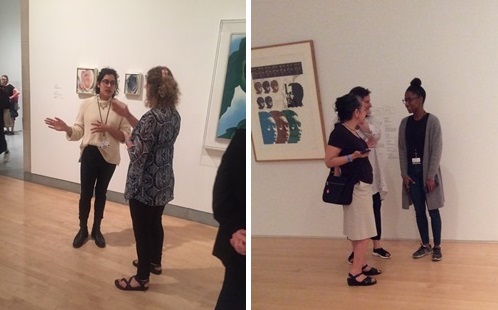
As promised, this week’s post is on our second pilot in search of our direction for ASK 2.0. For the first pilot, we provided devices…
Read More
As I prefaced in my post last week, while ASK has been successful from an engagement standpoint, we are stalled at between 1-2% use rate….
Read More
Radio silence from us usually means we’re up to something and this time is no different. Since our last post in May, we’ve been looking…
Read More
One of the things we learned from ERm’s evaluation was that ASK users really appreciate when the responses to their questions are well timed (i.e….
Read More
This month marks one year since the reinstallation of the Museum’s fifth-floor American art galleries, formerly known as “American Identities: A New Look.” This anniversary…
Read More
Early on in the course of ASK, Shelley and I noticed some really interesting patterns related to where people tended to use the app. While…
Read More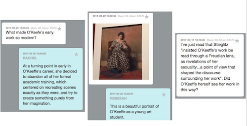
Our special exhibition “Georgia O’Keeffe: Living Modern” opened on March 3, and—not surprisingly for a show about such a famous artist—it’s turned out to be…
Read More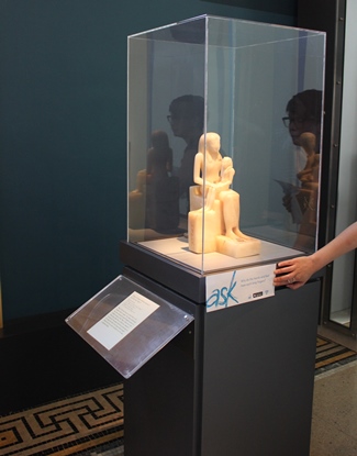
As part of our original messaging with soft launch, we deployed gallery labels advertising the app. This first round included questions that we hoped would…
Read More
In a recent conversation with colleagues from the Peabody Essex Museum, Sara and I fielded a question that frequently arises: which works of art do…
Read More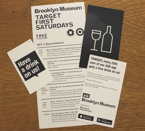
If you’ve ever visited the Brooklyn Museum on a Target First Saturday, you know what a special experience we try to provide for our visitors….
Read More
In my last post I wrote about our process for deciding which collection highlights to include in ASK’s new self-guided tour, titled Highlights and Hidden Gems….
Read More
Our entire ASK program has been built upon regular user testing and evaluation, which we’ve always completed ourselves…until now. Since we’ve been trying for over…
Read More
Earlier this week, Sara introduced the topic of ASK’s new collaboration with our Group Tours office and our efforts to shape the content of our…
Read More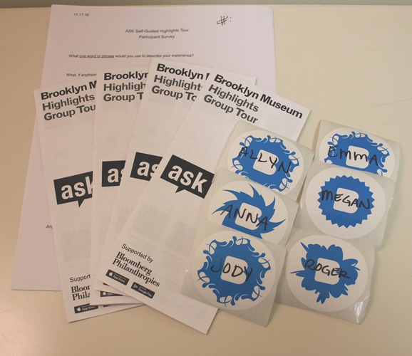
If you’ve been following our blog, you know we spend a great deal of time focusing on getting our ASK app in more people’s hands….
Read More
Since time immemorial, nerds have been listing things and memorizing them for fun. 2,000 years ago, the Roman writer Pliny the Elder published his Natural…
Read More
I know it’s been pretty much radio silence here since my last post about the MUSE Awards, but rest-assured, we have been busy! Over the…
Read More
I’m delighted to share that my suitcase was a little bit heavier on my return trip from the annual meeting of the American Alliance of…
Read More
If you’ve been following our posts lately, you’ve noticed our tech team has been doing some amazing behind-the-scenes work in anticipation of our Android launch…
Read More
Extremely smart people dedicated to the field of machine learning have made tools that are not only better, but far more accessible than they have…
Read More
A number of things happen after a visitor has a chat with our ASK team. At the end of each day, the ASK team takes the…
Read More
Every second counts when the ASK team is responding to visitor questions. With that in mind, a few weeks ago we looked into how we…
Read More
It’s been a year since the original ASK team arrived at the Museum, and we’ve been reflecting on all the ways ASK has evolved over…
Read More
ASK Brooklyn Museum for Android is now available on Google Play. We had one early quandary, but this was a fairly straightforward development process. That is, until we…
Read More
As the ASK Team gears up for the app’s Android launch in April and expands to two full-time members and four part-time members, it seems…
Read More
Hard to believe that it’s been a full year since we began the initial hiring process for our ASK team. We’ve accomplished so much in…
Read More
As reported earlier, the Android version of our ASK app is due to launch in April. For the most part, the app will look and…
Read MoreOur Android release is coming in April. I’m often asked about our strategy to expand into Android when 74% of our users are on iOS…
Read More
It’s been just over a year since I wrote about the realities of installing ibeacon to scale. Our ASK app, funded by Bloomberg Philanthropies, has been active…
Read More
In one of my previous posts, way back in March 2015, I discussed our initial plans for a shared research database (an “ASK wiki”) which…
Read More
I’m sure it will come as no surprise to anyone that getting out of your own head every once in a while can have great benefits. We’ve…
Read More
In our last post, Sara discussed our ongoing definition and refinement of the ASK app’s engagement goals and our recent collaborative workshop with some of…
Read More
We developed ASK based on the premise (determined by over a year’s worth of pilot projects) that our visitors want to talk about art with…
Read More
Things have been pretty quiet over here for a while—have you noticed? We had been blogging our progress on ASK weekly and in my last post…
Read More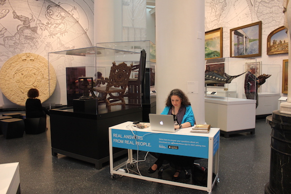
As summer draws to a close, so does our testing for the location of our ASK team. You may remember the results from our earlier testing in…
Read More
We all struggle with how to measure success. We’re thinking a lot about this right now as we begin to put the pieces together from…
Read More
Knowing what we know about our visitors, we figured pretty early on that we would need to offer face time with staff as part of…
Read More
Perhaps its the nature of an agile project, or just this agile project, but at each stage of ASK Brooklyn Museum we find ourselves facing…
Read More
If you think about it, building a project is fairly straightforward. It’s a one way street of sorts; a controlled process with steps involved, tests we can run, and timelines…
Read More
In my last post, I discussed our “opening response” and slight tweaks to make that a better experience. Our “first response” (the first message the…
Read More
What is the pedagogy of a text message conversation? Can you actually have a pedagogy of texting? If so, what does it look like? How…
Read More
Sara and I couldn’t be happier to have ASK featured on Museum 2.0, so instead of blogging our own progress this week we’ll point you…
Read More
At the Brooklyn Museum, we like to take inspiration from many things. After recently watching “Mad Max: Fury Road,” we realized to make our servers…
Read More
We’ve talked a lot about how user expectations helped shape our implementation. There are times when it’s incredibly valuable to listen to your users, but there…
Read More
When we first began thinking about the lobby reconfiguration, the need for flexible and moveable was paramount and all of our discussions with the design…
Read More
Shelley and I like to cast a wide net when looking for inspiration and ideas, often looking outside the museum sector from the customer experience…
Read More
As you’ve been reading, ASK Brooklyn Museum isn’t just about an app—it’s an initiative that seeks to re-envision our visitor experience from top to bottom. That “top”…
Read More
In every project there’s always a moment where the timeline starts to shrink. You start to look at your launch date and the to do list (ours is…
Read More
Last month we had the pleasure of introducing the six members of our audience engagement team, the specialists who will be engaging with visitors via…
Read More
As I introduced in a previous post, SITU Studio was brought on board to design a mobile, flexible, and temporary set of furniture components that…
Read More
When you’ve got any tool that is designed to answer questions the danger is that people think it’s an automated system; with ASK we need to…
Read More
In my previous post, I talked a lot about agile development and where we failed it. Agile has also thrown us some serious curves in…
Read More
As we march toward our June launch for ASK, it’s a good moment to look back at some of the issues we’ve faced along the way….
Read More
Our ASK team has a number of exciting challenges ahead of them. How do you communicate information about art in an informed and engaging way…
Read More